 |
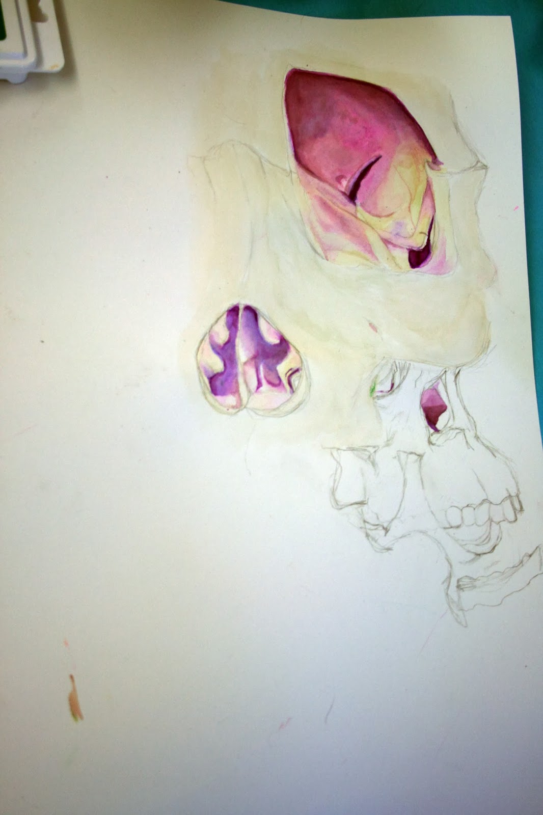
| Cubist in process painting |
Basically what i was attempting to do in this painting was to push
myself as far out of my comfort zone as i could. As someone who loved
detail and tends to render things a lot i struggled with keeping
the geometrical shapes within my painting as one solid
color. At the same time that's why i chose to use la llorona
by Picasso as my inspiration for this piece. The think painterly lines,
bright solid colors and overall use of geometric shapes is far from my
style, that is what intrigued me and pushed me to attempt
to change my style of painting. To say the least it has been hard, but
fun as well. Now i'm trying to incorporate some of the slight color
blending that shows up in la llorona into my piece. Since Picasso use
oli paint and i'm using acrylic this makes my life
slightly harder, but i'm trying to get around that by adding washes. I
like the weathered looked that the main green building has and that was
basically what Picasso had. So if anyone has an idea of what colors
would look good glazed over the dark and light
blue of one of the buildings I would appreciate that. Also i'm looking
to see people's reactions of how i used the negative space.( the red in
the painting.) i want to know if it works effectively and draws in the
viewers eyes. Overall I just want to know
how i can make my painting stronger, like i said this is much different
then what i normally do so i'm more then happy to take advice on how to
just make my piece look better. thank you :)


Hi Maria, I think you are doing a good job at incorporating your culture into your art. For the top one, are you planning on using other colors to distinguish the two figures from each other? I think that would be helpful and a good way to draw attention to each object. I also like the very bottom one. Maybe try emphasizing highlights in the hair because that is the part that catches my attention.
ReplyDeleteGreat work! I particularly like the one with he bird cage. I love the color choices and the way you over lapped the lines and water color.
ReplyDeleteI love the colors in the picture in the middle. I would add some more shadows to the clothing and some highlights to the hair. In the first picture it's hard to distinguish the pictures from the watercolor, it would be easier to make out if the lineart was bolder. I can't wait to see more of your art.
ReplyDeleteHey Maria! :) I really like in the first one how there is so much going on with the black pen and then the color is a separate element.It adds a sense of detachment and I am honestly very partial to illustrations with a lot of objects all close together, busy ones I guess. So this looks really cool!
ReplyDeleteI really like the way you used a similar expression in each of these, but used different colors and techniques to make each one very different from the others ones. I especially like the way you used color in the first one and the details in the last one!
ReplyDeleteHey Maria, I really like the way you including different aspects of your life into your art, each one of your drawings give off a different vibe. I also think your color choices really come together.
ReplyDeleteHi Maria, I really like your cubism piece so far. It's different compared to what you have done in the past. I like your use of geometric shapes and complementary colors. I think it would be cool to incorporate shadows from each structure onto the other, or some type of gradation to make certain parts seem more 3D. You could also mix 3D and 2D, which you have already started to do.
ReplyDelete