The colors really lend shape and life and a more real but stylized and interesting element. This shows up especially in the metal and the speckles are intriguing. It feels like you could try more things with the negative space, more obviously in the first one because there isn't the symmetry of white that there is in the second piece. Although, the white it well offset by the black in the other corners.
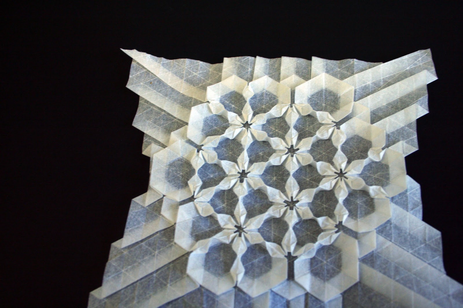
I think you have found something special with your origami, and I think it could be interesting if you found a meeting point between paper-folding and traditional painting/ drawing.
Your attention to detail is amazing, especially in the drawing of the skull. The shadows and highlights are very well done! I also really like the colors you used in your third work, they really come together nicely!
I really like the shadows in the painting along with the color choice in the cubist work. I also really like the way you blended the colors together in the cubist work, it seems abstract and realistic at the same time. Your attention to detail in the drawing of the skull makes it very realistic. Nice work!
I really love the cool color you use throughout the drawing. Blue and Green give calming effect. I wonder what is the light area on top represent? A sense of hope in a dark area?
Everything looks really good. I especially like how your cubist painting mirrors your previous work with origami. Maybe this is something you could continue to explore.
I really like how your cubist project is coming along. The shapes create a nice feeling of depth along with your color choices. I also like how the elements are spaced out to create a foreground and background.


I really like the colors you used for these pieces, especially the blue and green one. What medium is this?
ReplyDeleteThe colors really lend shape and life and a more real but stylized and interesting element. This shows up especially in the metal and the speckles are intriguing. It feels like you could try more things with the negative space, more obviously in the first one because there isn't the symmetry of white that there is in the second piece. Although, the white it well offset by the black in the other corners.
ReplyDeleteI think you have found something special with your origami, and I think it could be interesting if you found a meeting point between paper-folding and traditional painting/ drawing.
ReplyDeleteYour attention to detail is amazing, especially in the drawing of the skull. The shadows and highlights are very well done! I also really like the colors you used in your third work, they really come together nicely!
ReplyDeleteI really like the shadows in the painting along with the color choice in the cubist work. I also really like the way you blended the colors together in the cubist work, it seems abstract and realistic at the same time. Your attention to detail in the drawing of the skull makes it very realistic. Nice work!
ReplyDeleteI really love the cool color you use throughout the drawing. Blue and Green give calming effect. I wonder what is the light area on top represent? A sense of hope in a dark area?
ReplyDeleteEverything looks really good. I especially like how your cubist painting mirrors your previous work with origami. Maybe this is something you could continue to explore.
ReplyDeleteThis is great Catherine! I love the detail in your shading and your great pen work. I can tell you worked really hard on these!
ReplyDeleteI really like how your cubist project is coming along. The shapes create a nice feeling of depth along with your color choices. I also like how the elements are spaced out to create a foreground and background.
ReplyDeleteLOVE
ReplyDelete